Wednesday, 7 March 2012

Group Crit...

The acetate images I produced before the group crit:
I made three copies in the style of my drawings and edit previously. the first is a simple outline, the second I have coloured it in with acrylic paint, carefully filling the lines but not worrying about the thickness or smoothness of the paint application. For the third I roughly coloured it in to give a suggestion of where the colour would be.

Before making a discussion on which one to show to the group I trialled each copy on the over-head projector to see which would best on a large scale as shown below:


Unfortunately the acrylic paint wasn't thin enough to let the colour be projected onto the wall so my choice was made for me. I went with the plain outline which projected clearly onto the wall (not shown as clearly in these photos). Although the colour wasn't clear on the wall, it was illuminated on the over-head projector, the best in my opinion being the solid colour. In the future, if I didn't want a projection, I could light a piece of acetate/perspex/glass etc with my image on the front. 

Whilst setting up I noticed a chair that was similar to the one I had drawn, so I put it in place and hung my coat on the back in the hope that this would add the illusion or installation in the studio rather than a 2D image hung in a gallery:

So for the group crit. Without explaining what my work is about this is what they got from the piece and their thoughts when looking at it:
  • Is it my room?
  • Is it personal to me?
  • The projector makes you think of your own personal space that you can pick up and move around.
  • Seems to have a light context/not too serious.
  • Not cold.
  • Cartoony/has an animation feel to it.
  • The soft lines suggest a hand drawn quality.
  • Reminds them of illustration in a magazine cartoon, like the Daily Week
  • Telling them a story?
  • The chair gives the illustration a fine art quality.
  • Different fields of design (graphic, illustration, art), the chair makes it hybrid, fine art and into an installation.
  • Bit of an illusion, with the chair it looks like you could just 'pull up a chair' and sit down at your desk/ inviting.
  • Brings the virtual (the illustration) into real space.
  • Could do some work on the chair to make it look more like an illusion?
  • The drawing of the chair on the image is noticeable behind the actual chair which made them realise that was the place it was intended to be in that position.
  • My everyday.
  • Snapshot of my studio space.
  • Mundane/everyday.
  • Site specific.
  • Works with the other things around it/ fits into the environment with the other studio space being around it/ could be walked past/ ignored.
  • The natural vibration of the old projector makes the image move a bit.
  • Noticed the blank posters, book and laptop.
  • Could be a flat pack desk that is ready to use.
  • The objects in the image make it busy yet the blankness of personal object make it empty.
  • The chair is empty to.
  • Everything is there ready for someone to use it.
  • Part of my life in the most simplistic form?
  • Projector feels childish because of the memories of it being used in primary school or at a young age.
  • Could paint the chair white with solid black lines to look like it's part of the image coming out from the wall.
  • Two people in the group (of five) liked the fact that I had used a real chair as it makes it seem more like real life/ brings it into reality/ painted would be too obvious.
  • The busy yet empty feel could be a comment on life in general/ everyday life.
  • Ignorable image/ ignorable spaces?/ in between spaces?
  • Everyone has this space, a desk, chair and their belongings, but arrange it in their way/ easy to relate to.
  • Tate Modern had an show a scale model of a fashion office which felt like a behind the scenes/ transitional space?
  • Empty space is evocative.
  • Artists that relate to it; Michael Craig-Martin, Paul Caulfield, Michael Landy (illustrator who draws mundane situations).
  • If it had a title would it be called 'Everything I own'?
  • The over head projector showing the acetate talks about the process of it's own making/ construction of the image/ projector is a blurring of the boundaries.
  • Hand drawn quality juxtaposes with the sharp lines of the chair.
In conclusion I was very pleased with comments, without any hints or being provoked they seemed to understand what the piece was about and get a real sense of what I was trying to achieve. I agree with the people that said they prefer the chair being real but I think it could be interesting to try it out. Also looking at light up clear pieces instead of projecting. I also want to research Michael Landy and Paul Caulfield. 

Sunday, 4 March 2012

Grand Union...

For my professional practice module I had to visit Grand Union a gallery found in Digbeth (5 minutes walk from where I live). As a tutor group we had to analyse the exhibition Before the Revolution by Torsten Lauschmann and then create a 45 minute presentation based on our criticisms. Below is the slideshow I put together for the presentation of the photos I took on the day we visited:


For my 5 minutes of the presentation I had to answer (which I've provided) the following question:

1. Of the selected works for discussion, what are their physical properties, for example, what is it made from? How big is it? How has the material been treated?
The four pieces in the exhibition are either made from different properties or shown in different ways, ‘Before the revolution’ is a two minute video shown on a monitor on loop, ‘Life like’ is an installation of ten working metallic desk lamps, a switching unit, computer soft and hardware and mixed media, which is pretty much an assortment of different sized rocks, the dimensions of this piece vary every time it is installed. ‘Thaumatrop No1: Bird in a cage’ is a two minute video Projection on loop and ‘Skipping over damaged areas’ is a ten minute HD video projected onto a free standing wall, with a wooden seat placed in front for viewing.

2. How does it’s scale, material handling and installation have bearing on its meaning?
The monitor and lamps are normal domestic objects that can be found in any household making them easier to relate to and perhaps understand, for example with ‘Before the revolution’ the use of a monitor, probably around the size of a 28” screen, can be instantly linked with a computer monitor, which would push people to believe that this is a loading image rather than a functioning piece of work. ‘Skipping over damaged areas’ being projected onto a large floor to ceiling screen with a small wooden seat placed in front invites the audience in and makes it appear like a cinema, setting up the viewing for the content of film titles shown.

In a lot of cases the evidence of technology was left visible to the audience. In ‘Life like’ wires being tangled and grouped together in a corner, whilst clearly attached to a machine that turns the lamps on and off to a set time takes away the mystery of the functioning of this piece. Projectors are not hidden away and the screen on which the film ‘skipping over damaged areas’ is projected onto can be walked behind. This leaves the questions of intention, where these things left out to make the viewer consider the workings of these piece or to take away the fascination of the mechanisms so your focus is solely on the work only. Perhaps there was no intention at all but just laziness on the galleries part. The lamps being made out of a metallic material and with lots of lights around it means that the large amounts of dust that have been left on it are easy to spot, tape is still stuck on the floor and a stepladder is left behind the screen, but all of these things could be part of the galleries laidback approach suggested by it’s urban, industrial environment.


3. Where does the work come from? Does the object have a different relationship to our culture than to its own, if different?
All of the works in the show are created by Torsten Lauschman, a German artist that has previously studied in Glasgow. Originating from a country that speaks a different language there may have been concern of miscommunication in the pieces when being shown in England, However Lauschman  has chosen to show his work with English titles, even the film ‘Skipping over damaged areas’ shows film titles written in English. Although having studied elsewhere and travelling a lot, the period in which Lauschman make all the works shown, 2008-2011, a lot of his time was spent in Glasgow, this could explain his choice in using a more universal language than German, making his work more easily accepted by a wider audience.

Even though Lauschman is from a different country, he is still part of Europe and the western world, so the use of modern technology (the wires, projectors etc) can be accepted and understood, this, along with the choice of language, would mean there would be no difficulties with the communication of the pieces.


Preparation for the group crit...

So this is what I'm thinking of showing for the group crit, if I can get a projector confirmed then I will draw this onto an A4 piece of acetate and then paint the colour onto the back using acrylic paint, which will then be projected onto a blank wall, hopefully full sized. The only problem with it will be how the bottom of the wall in this image won't match the bottom of the wall in real life, but if I did match it then half the image will be projected onto the floor, I'm not going to change it though as I'm interested to see what the group will think of it and these are problems I'm already aware of so they can be changed in the future. 

Friday, 2 March 2012

Some practical work...

Something that I've been working on is collecting some sketches around my area that I currently live in as a student. All of the locations I've tried to capture the same presence of life that the image from my living room original caused. Moving forward with the same style of simple graphic lines like a stain glass window but also focusing on the idea of the hand drawn approach that my tutor liked in one of my examples. With my sketches I used a thin fine liner to get the initial sketch and then a slightly thicker brown fine liner to get a more defined line, however I wanted it a bit thicker to make a clearer more graphic mark which annoyingly took a bit longer but also made me concentrate more on detail. Below are my first six drawings (click to enlarge):


I wanted to do the same with these drawings as I did with the kitchen drawing/edit that I did early on in my first term by filling it in with flat colour in Photoshop, but I thought before that I'd also show the in between in case I decided to do anything with just the line drawings:


Here are the edits with flat colour:


One of my ideas is to project an appropriate scene in a space relating to that image using a projection from acetate. I like the idea of being able to draw with clean lines on one side and then give a suggestion of colour on the other side to see if it makes a difference to the clean-ness of the above picture. So I've edited the same line drawings with the same colour schemes but without worrying about going over lines or filling in white spaces:


On Monday 5th March I have a group crit where I have to show a piece of work as though it is being exhibited. I think I want to set a scene which would be found in the studio space that it will be shown in  and create a similar line drawing to those above on acetate and then paint the colour on behind and project it onto the wall.

Wednesday, 29 February 2012

More window updates...

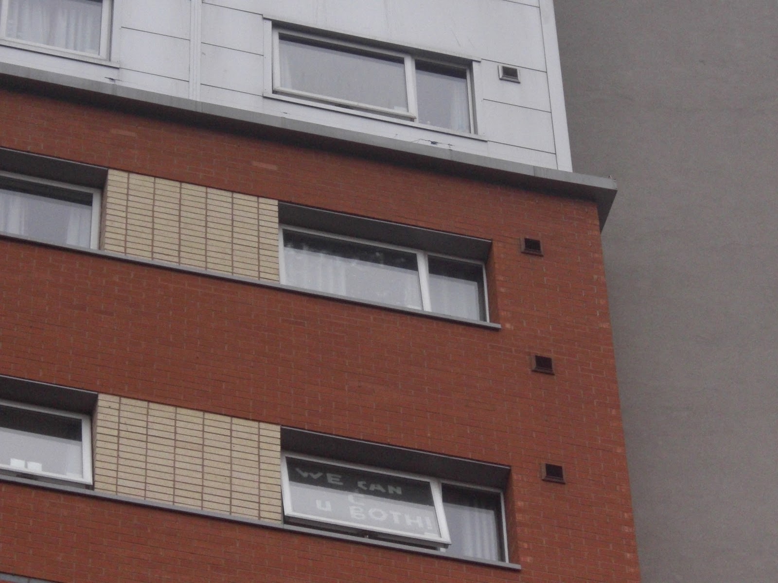
So the masking tape messages have gone further than I thought, originally only being between my flat, the flat opposite and the flat above that, more have now joined in. When stood on the other side of my accommodation you can see other flats in the same block as mine that have the following messages:
'hey Big Boi'

'Marry Me'

'We <3 what we C'

'We can C U both'

They are placed all over the block which is also 10 floors high. The two last ones are clearly related to what has be previously written but the other two messages 'Hey big boi' which is written with paper and 'marry me' in a small font are a bit random compared to the others, but they have obviously been encouraged by the masking tape messages. who knows what will come of it.

Ikon Gallery...

After visiting the New Warsall Art Gallery last term I've decided to go into an exhibition with as little knowledge about it as possible apart from the title and the place that it's being shown in. So with that in mind I've listed the 3 exhibitions that were shown in the Ikon gallery when I visited it on 31st January and explained my original impression of the show and then what I thought of it after having read about it and learning the titles of the individual pieces:

Stuart Whipps Why Contribute to the spread of ugliness?
              
The first piece you see when entering this exhibition is one of Whipp's Videos named 'England and the Octopus, Britain and the beast' (shown in the top right photo), simply a film of a beautiful waterfall, a railing and a man trying to capture it on camera. Without the title I would look at this as a man wanting to get a nice photo, most likely a tourist, however due to the title of the exhibition I couldn't help but look at the piece with some thought of negativity, almost judging the person in the picture. Realising this I tried to think of what the artist might be trying to comment on, does he think that people should try and appreciate the beauty of nature rather than looking at it through a lens, or maybe because of new technology anyone can buy a flash camera and suddenly think they're a photographer by taking yet another photo of a waterfall.

The next room had three projectors showing slides onto different walls in opposite directions (shown in photos two to six) with the slides changing at the same time but not necessarily showing anything, this piece was called '487 Uncatalogued Boxes'. The slideshow shows different derelict spaces like cars parks, the outside of buildings like office blocks and damaged cardboard boxes, seeing the title now it is more obvious that the pictures all seem to have some sort of box like form. The industrial spaces remind me of the buildings that have been left to become empty in the space around where I live and of the houses that Edgar Martin photographed for 'This is not a House', they are empty yet have a feel of some previous activity. When considering the title of the exhibition perhaps Whipps is commenting on leaving these building with no intention of improvement or reuse is ugly because of it's appearance but also because of the waste that it leaves behind.

When reading about this exhibition it's interesting to find out that Whipps' 487 Uncatalogued Boxes' is showing the archives (and the boxes they came in) of John Madin's architectural plans with the buildings that they refer to. It mentions how the Birmingham Library which Madin designed and was once seen as 'a landmark of post-war functionalists architecture in Britain.' is going to be demolished in 2013, I feel like I got this feeling of sadness when looking at the work, it was clear it was a sort of documentation but almost like crime scene photos they were heartlessly and factually collecting data on these abandoned buildings. Considering the amount of redevelopment going on around my area it makes me want to look more into what they are planning on keeping or redeveloping and what is completely going to be redesigned or taken away. Although maybe not a human life everything has it's own life span and so exists for a period of time and it's these objects, buildings and environments that we exist around/in. I guess that's why I have such a fascination with what's going on around my home, because it's so relevant in my life at the moment.

John Myers Middle England
John Myers 
 John Myers
For John Myers exhibition he shows his photographs, all about A4 size or less and spaced equally around the room at eye level in frames. What I noticed first about the photos was that they all seemed to have the same composition, most look like full length portraits with the person in the middle, the scenery/environment framing them. The title gives away the connection between them all, their class, but because of their surroundings and appearance that was kind of apparent any way, although it could also be a comment on the location, so Midlands, which would make sense with the show being Birmingham. Because of their clothing it suggests that these are old photos, emphasised by the black and white effect, however because there are so many of them that are conveniently the same I feel like they could have been staged, unless perhaps this is an old collection of his that he has decided to re-exhibit. This exhibition was the one that made me want to go to the Ikon, capturing the people in their environment is what my work so far hasn't done, I've always purposely leave people out of the scene, focusing on the absence of the figure and the presence they leave behind, so it was interesting to see what it would look like if I included people in the space they live in.

The first thing I found interesting when reading about this exhibition was when the photos were taken, 1970's. So this answers the question of whether they were staged to look like they were taken around that time or whether they were genuine. Next was just how similar Myers investigation was to my own. I was drawn to this particular show anyway because of it's visual similarities but as I read on in the Ikon leaflet similarities became apparent. 'Myers chose to photograph people who lived within walking distance of his home, and so he recorded his world as he knew it' - Like me looking at the space and direct environment around me to look at my own life. 'The juxtaposition reminds us of the fact that we are shaped by our built environments, as much as we shape them' - reminds me of my recent consideration of the development of new buildings effecting our existence within a space and how it may be considered in the design of that space/the life span of that building. '[in Landscapes] for these photographs, Myers ensured there was no hidden story; this is an urban scene without the distraction of the human figure or any implied narrative.' - I currently have been making more drawings of spaces that I feel have a presence without a person being there and in the past term all of my work had an absence of figure.

One final thing that intrigued me about this work was the mention that some has been display outside the space in which the new Birmingham central library is being constructed. Firstly it reminds me of how I am looking at taking my work outside or into new spaces that are relevant to it, but also is interesting considering the work of Stuart Whipps whose work comments on the demolition of the old Central library and is shown within the same building as Myers.


Dean Kelland Living Room Series (Episode 2): The Desperate Hours

The final exhibition in the gallery was a film by Dean Kellend. Shown in a dark room, Kellend repeats the recognisable line from the popular series 'Steptoe and Son', trying to perfect the dialect and improve his impression every time. Dressed like the character and pulling the same facial expressions you can picture yourself sat in front of the TV at home, which is emphasised by the title 'Living room series'.

Ikon describe the work at looking at the 'mechanics of performance and portraits of masculinity' but what I found relevant about the work was how Kellend's interest is apparently in the language of popular culture. At the begining of this whole investigation I started with this idea of what effects our lives and is current in our lives by being inspired by magazine, newspapers and travel, which are all things that interest Kellend, however he also focuses on comedy series like in this example. Like in John Myers study of Television sets, I like how Kellend draws attention to the everyday in a scene we are familiar with causing us to look at it more closely. As for the actual curation of the film, I fond it interesting when researching the work to find examples of the same film shown on an old worn out television set, I think if I saw it this was I wouldn't have need the title to have got the feeling of watching it in a living room setting, it reminds me of when I showed my films of trains on 3 television sets and then decided that I only wanted one to be shown either projected or on a monitor so there were no distractions, I wonder how I would have felt about the work having scene it on a smaller scale rather  that the large screen in the tiny room at Ikon.

Sunday, 26 February 2012

Another Living room window update...

After pointing out the top window mocking the 2nd window down in my last update by writing 'we see you both' the second window down has responded. Subtley they have changed their message from 'we see you' to 'we like what we see', so now where the window above says 'they can't see us' pointing to the window below them, the 2nd window down is now saying that they don't like them. Part of the fun of living in student accommodation is the wittiness of the young people you're living which is shown by this example, but I guess it also helps that this sort of environment is filled with people with plenty of spare time to write on their window in masking tape! 


Thinking of it in terms of my existence, this response from the direct audience will help record this period of my life. The original image I made on my window showed the place I lived in for a brief moment in time, but the interaction from those I am living around gives a sense of where it is and my time at university.