On the 13th December my tutor group and I set up an exhibition to display one piece of work each in our studio space. After sharing some ideas as to what the exhibition could be called Charlie came up with the name 'Hybridity', finding that the word refers to a mixture that creates a single body... culturally and biologically it refers to the blurring of distinction. This definition seemed perfect for an exhibition of pieces that were more likely not going to relate to each other yet still be shown as a whole. This was our poster:
This is how we used the exhibition space:
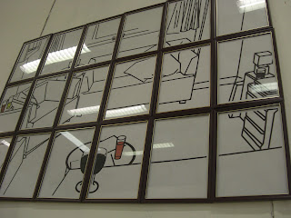
I could have shown my film again with the improvements suggested in the group tutorial but I wanted to see try out one of my new ideas. I chose to take one of my Michael Craig-Martin inspired pieces. I wanted to continue with the idea of making an everyday situation more special by adding techniques that would be easily recognisable, for example making something larger would suggest it had more importance than something on a smaller scale. I chose to blow up one of my edits onto a larger scale. When considering how to present this, whether to print it as a whole or in smaller pieces I thought of how the pieces could look like sections of a window frame. I split my image into eighteen A4 pieces and put them each into separate frames, the idea being that when they were put together and hung on the wall they would hopefully look like a window frame with my image being the 'stain glass window' effect.
One of my ideas was to put black tape and coloured acetate directly onto a window to make a stain glass window, but in this white cube space I think it's appropriate that the sections were printed and had white backgrounds, as though this could have been a ready made window placed onto the wall.
I chose frames in a dark wood with a gold trim as I though when put together they would look like the sort of window frame you might find in a church. This would hopefully encourage people to see the complete piece as an important symbol. I tried to get the frames as close together as possible to give more of an illusion of it being a whole. I suppose this could have been done more easily by getting an actual window frame, but this may not have been to the correct size and I also liked how it wasn't to obvious. This piece could be seen as separate parts to make a whole, I wanted the viewer to get the same feeling as they do when presented with a large image or religious symbol but for them to not perhaps know why they thought that way about it.
I like the reflections the light causes when hitting the glass, it distorts the images and makes it less visible from certain angles but also adds a quality to it as though it is a precious item, which is enhanced by the use of gold.
Looking at the work a lower angle as shown above gives it a more overwhelming effect. For the exhibition I displayed this piece at eye level to fit in with the other works in the show, however if I were to display it again it might be an idea to put it up higher like the windows you may find in a church .
Before putting up the frames I laid them out onto the floor. Some people made comments that they liked the gaps in between and the contrast between the wood floor and the white background of the pieces. Others whilst passing said it reminded them of a London Underground tube map with the black lines and occasional colour blocks. This could work well with the film of the trains and the idea travel being part of our everyday journey and existence. The final comparison was with Dexter Dalwood, as though it was a window you looking through into someone's living space.


No comments:
Post a Comment